
As companies evolve, the desire to rebrand and portray their new image to the audience is natural. The business name, mission and vision, logo, and color palette are all a part of a brand’s identity. Amidst the excitement of a makeover, companies often overlook some common rebranding pitfalls. In this blog, have simplified some of the major rebranding failures and what lessons they teach us.

Common Reasons That Lead to Rebranding Failures
- Companies jumping the gun and not investing in research. In other words, it’s important to analyze your target audience, industry, and competitors exhaustively before rebranding your business.
- Underestimating the role of packaging in branding. Your packaging determines the relationship your customers form with your brand. Hence, you must consider how your audience currently perceives your product before doing a 360 with the aesthetics.
- Changing the logo and ignoring everything else. It shouldn’t come as a surprise that your rebranding failed if you only changed the logo. A rebrand must represent a fundamental change in how you position the business.
Famous Rebranding Failures and What We Learnt
1. Weight Watchers

In September 2018, amidst the wave of the ‘body positivity’ movement, the company decided to rebrand themselves from Weight Watchers to ‘WW’. As a brand, they wanted to broaden their clientele- including people that wanted to lose weight and the ones that wanted to make healthy lifestyle choices. These rebranding efforts by the company weren’t welcomed by designers or customers.
The company also ended up losing up to 600,000 members and saw a record low of new memberships. The new brand image was uninspiring and the logo design boring, to say the least.
What can we learn?
While the idea of aligning itself with the new trends was commendable, the execution was poor. Weight Watchers was launched in 1963 and had since become a household name. With the new name and agenda, they alienated their primary audience. It is also noteworthy that their new image didn’t score any points with their new target audience.
Therefore, it is important to remember that your rebranding shouldn’t drive away your loyal customers. In fact, it should align with your company’s core values
2. Tropicana
In 2009, the parent brand PepsiCo. decided to undertake rebranding efforts for the companies they owned. One such name was a well-known and cherished orange juice giant, Tropicana. Their rebranding strategy included a simpler packaging design, new logo, and a fresh color palette.
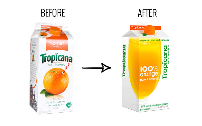
According to an Ipsos poll, 72% of Americans agreed that the design of a product’s packaging influences their buying decisions. Sadly, Tropicana didn’t hit the mark.
Tropicana invested around USD 35M in an ad campaign to promote the rebranded packaging. Nonetheless, they received a lot of criticism from customers. Two months after the campaign their sales dropped by 20% and eventually, they were forced to restore the original packaging.

The ad campaign that was released with the new packaging design.
What can we learn?
Changing too many branding elements at once can make you lose your identity and scare even your most loyal customers away.
We underestimated the deep emotional bond. Those consumers are very important to us, so we responded. What we didn’t get was the passion this very loyal small group of consumers has. That wasn’t something that came out in the research. – Neil Campbell, president at Tropicana North America in Chicago
3. Gap
Consumers use logos as the key identifiers of brands they love. Therefore, it comes as no surprise that Gap’s new untimely change in the logo design was a disaster of major proportions.
In October 2010, Gap launched a new logo with no warning to their customers. The original logo that had served the brand well for over 20 years was replaced overnight. The new logo featured the word ‘Gap’ written in bold with a blue square fading diagonally.
The new logo wasn’t received well by the brand’s loyal customers and they took to social media to express their disdain. Some people say this rebranding was so bad that it might’ve been a PR Stunt. In fact, it took less than a week for the company to revert to their old logo.
What can we learn?
Brands need to remember that branding speaks directly to the audience. Changing your visual identity has the power of changing how your audience perceives you. As they saying goes, ‘If it ain’t broke, don’t fix it.’ Despite what you may believe, your audience doesn’t tire of logos easily.
Conclusion
As can be seen, changing your brand identity without understanding the need of your audiences can be catastrophic. Above all, it can be overwhelming on your pockets and may not give the desired results. We hope you learnt from these rebranding mistakes. Let us know in the comments below what rebranding failures have taught you a lesson.


