
Whether you’ve been asked to come up with graphics for a brand’s social media accounts, or you’re starting on a dedicated journey in graphic design – we all need direction. In today’s world, people would rather design themselves through templates, than go through the process of hiring a professional. But, it’s not as easy as it sounds! So how do you go off making professional content with no experience? By following some key design tips in this creative process!
In this blog, we will cover the groundwork on the essentials of graphic designing 101! With our best tips and ideas, anyone can build on these core design skills! So let’s get started.
1. Minimalism: Less is More!
(Source: Studio Akronim)
Take away any design overload by including white space around your graphics!
While it may be tempting to place all your cards on the table through a design project, the real challenge is to focus on what’s important. By this, we mean letting your images, typography, patterns, etc have a space to breathe on the final design.
This can truly help the viewer focus on where your emphasis is meant to be placed. Additionally, you can also make use of negative space (or white space) around your elements and add a sophisticated feel to your graphic design!
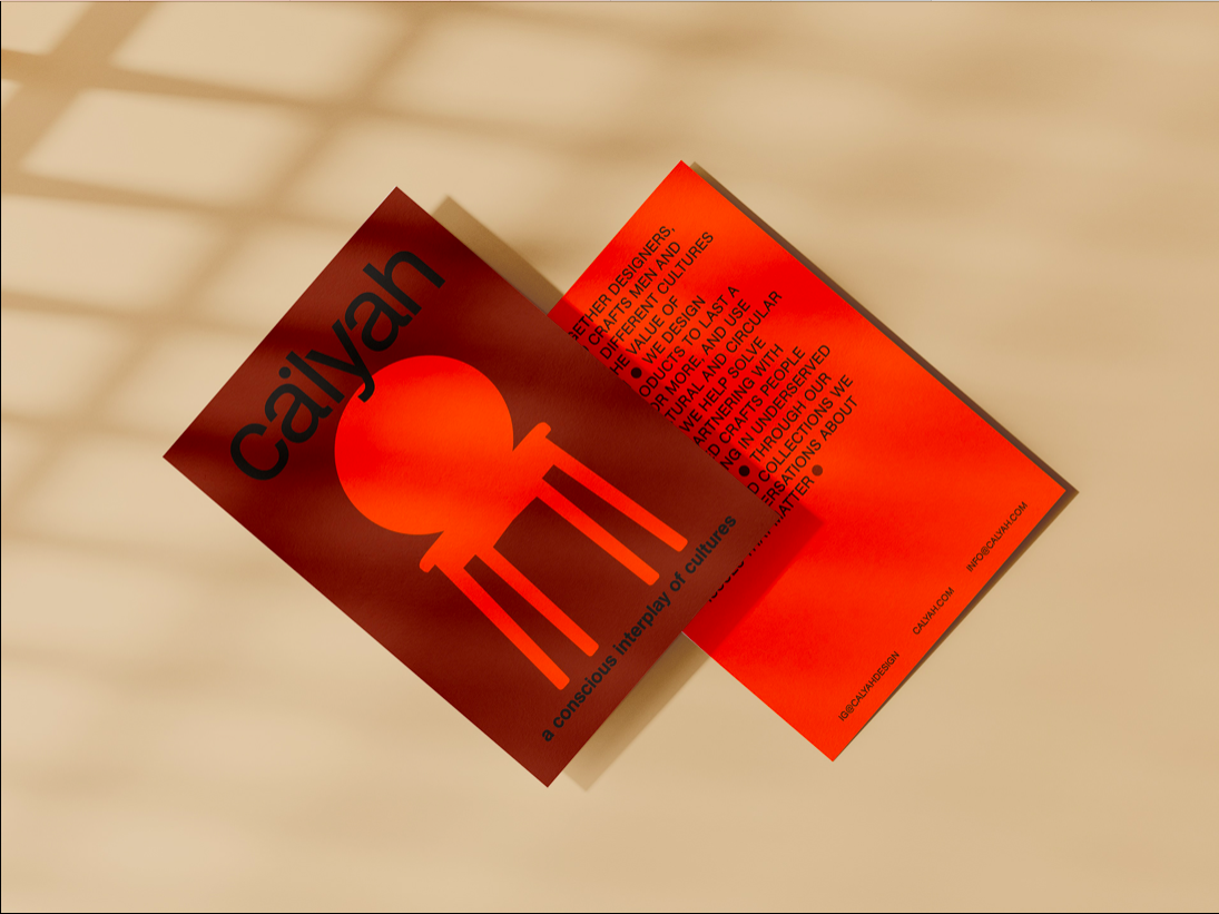
2. Stick to limited typefaces
(Source: Agnisa N. Putriana)
Logo Design Tip: Spacing your sans-serif fonts looks way better than a bold formatting
When it comes to selecting a Typeface, the key to an effective graphic design is to keep things as simple as possible. And despite the plethora of options available online, you don’t want to make your message unreadable.
According to our design tips, stick to a maximum number of two fonts, and preferably of the same family (Serif vs Non-Serif). Furthermore, stylize or format your type sparingly, as Bold or Italics in multiple places can compromise your readability.
3. Cohesion in color palettes
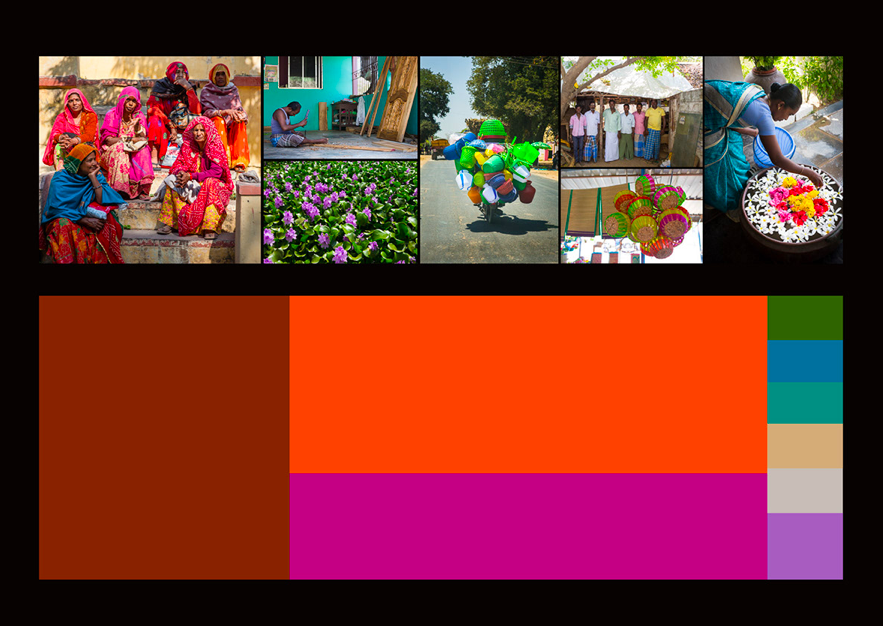
(Source: Boris Berlin)
The most cohesive design tips include the use of a limited color scheme that complements all other elements!
The main goal of any design is to convey a story in the most visually appealing manner. But in that light, a chaotic array of colors can prove quite distracting for the other graphic elements. After all, color cohesion is incomplete without consistency in your brand image!
Adhere to your brand colors or simply online available color palettes that can give you appropriate combination ideas. And should the need be, give variations to your viewer by brightening or decreasing the contrast of your Type color, and promote readability.
4. Alignment: Keeping the hierarchy intact
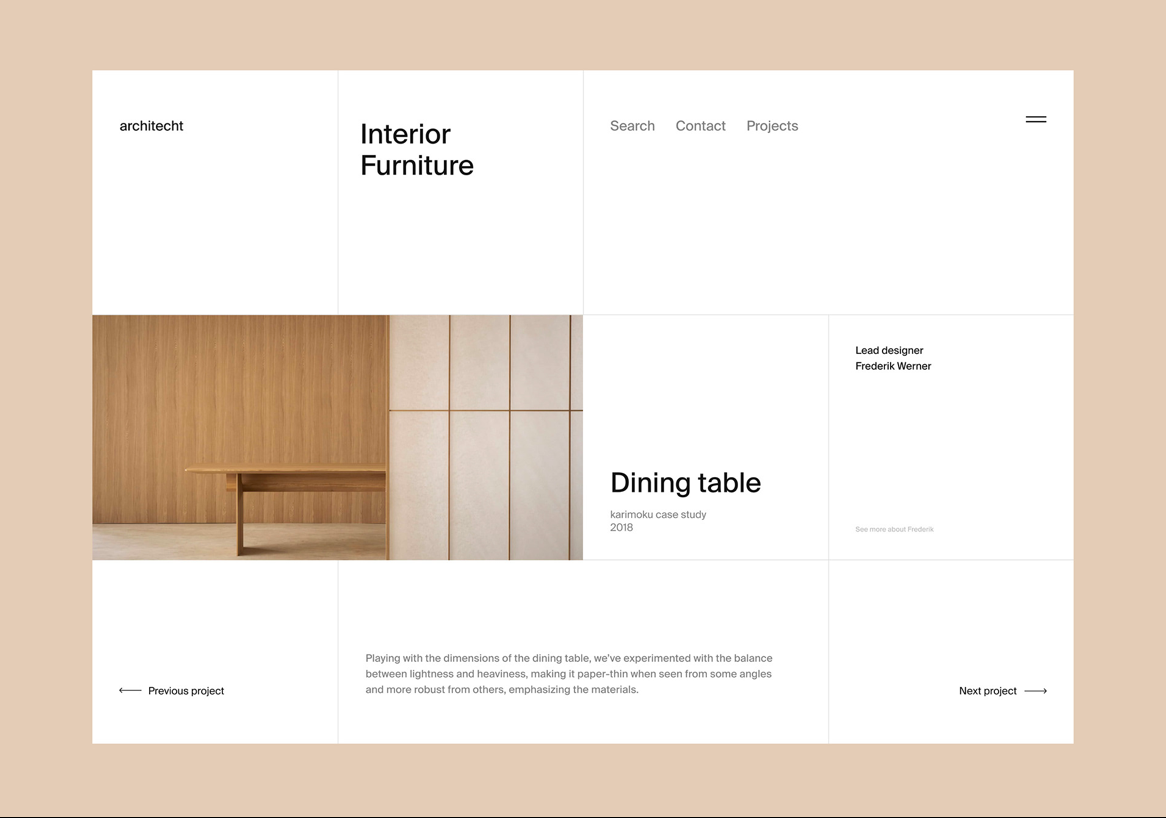
(Source: Artyom Konoplyov)
Discipline in design tips includes giving a structure to your elements with a proper hierarchy and alignment!
The very reason why we have headings, subheadings, body, and captions for any type of text, is to have more emphasis on one element than the other. And as for visual hierarchy, your goal as a graphic designer is to create a smooth flow of information for your audience.
Try using scales and grids, as in the example above, to give a symmetrical and geometrically aesthetic structure to your overall design!
Simplified Graphic Design Tips
We know how it can be difficult it can be to start any design project from scratch, especially if you’re an absolute beginner. With tons of social media templates and easy-to-use design tools to choose from, graphic designing is now super Simplified! Check out our blog on how to use your first template and our artboard guide here.
Happy designing!


![7 Best AI Image Restoration Tools to Try in 2024 [Free & Paid]](https://siteimages.simplified.com/blog/Best-Free-Paid-AI-Image-Restoration-Tools-01.png?auto=compress&fit=crop&fm=png&h=400&w=400 "7 Best AI Image Restoration Tools to Try in 2024 [Free & Paid]")
![How to Use Photoshop AI Generative Fill Feature [2024]](https://siteimages.simplified.com/blog/How-to-Use-Photoshop-AI-Generative-Fill-01-1.png?auto=compress&fit=crop&fm=png&h=400&w=400 "How to Use Photoshop AI Generative Fill Feature [2024]")
![20 Podcast Thumbnail Ideas to Boost Your Show’s Visual Appeal + Best Practices [2024]](https://siteimages.simplified.com/blog/Podcast-Thumbnail-Ideas-to-Boost-Your-Show-02-1.png?auto=compress&fit=crop&fm=png&h=400&w=400 "20 Podcast Thumbnail Ideas to Boost Your Show’s Visual Appeal + Best Practices [2024]")

