Close your eyes and recall some of your favorite brand logos! Which are the ones you could remember and why? Is it the vibrant color, an unusual design, or a catchy tagline that you could resonate with?
Logos are the cornerstone of a brand and are usually represented with some designs, a few fixed colors, and a tagline. But a logo is not just a part of the brand’s identity; a well-designed logo can communicate so much about a brand. If you’re looking for a guide to help you understand how to design a logo, this step-by-step guide is all you need. Also, yes, you can create a logo if you don’t know how to design using this guide. Read till the end because we have a cool free tool that will do the design heavy-lifting for you.
Example of some Iconic logos throughout history
1. Starbucks
The siren has been around since 1971 and has evolved since then. Today we can easily recognize the logo even if they have done away with the brand name in their logo.

2. Apple
People can love or hate Apple products, but everyone is familiar with the brand’s clean logo.
3. Mickey Mouse
Disneyland’s famous Mickey Mouse logo is everyone’s favorite mouse and one of the world’s most iconic logos.
What makes an effective logo?
Each business has its perception and interpretation of a logo, but a good logo should meet four goals irrespective of the business or the industry type. Remember, a good logo is important for your small business to create a brand identity.
1. Logo legibility
Anyone should be able to read the logo easily, especially if it has only text. Think about brands like IBM, SONY, Coca Cola or Canon. All these brands have a simple text logo but can be easily read and understood by their audience even from a distance.

2. It is distinct
While you can look around for inspiration for how to design a logo and take cues from the logo design trends to create your logo, your ultimate goal is to create a unique logo that is distinct from others – that can help you stand out. Remember, a distinct logo can make your brand memorable. So whenever your audience is ready to purchase, your logo should strike first to their mind.
3. Appeal to your audience
A logo is not just for your brand communication but also for your audience to relate to it. To create a logo that appeals to your prospective audience, consider the audience persona. For example, if you’re a children’s party organizer, your logo should be bright and colorful.
4. It can be scalable
A logo is a part of your brand identity, and you will be using it across different media channels in various sizes. So, ensure you have a versatile and scalable logo that looks perfect in any dimension. It should be easy to scale and fit in any media channel.
Understanding the anatomy of a logo
A logo has several sections like an icon, the typography, a tagline. Understanding the purpose of each section and how to create them can help successfully create a logo where all the elements stay in harmony.
1. An icon
An icon/symbol/or imagery is one of the important parts of a logo. It can be anything as simple as a dot or a line to a more complex shape with some typography.
2. Logo color
Logo color is distinct that remains constant throughout the brands’ communication channels. A logo can be in monochrome, black and white, or multicolored. If you’re creating a multicolored logo, make sure only to use the hero colors from your brand kit.
3. Typography
You will often come across a typography-based logo. It can be a monogram of a single letter, a few abbreviations, the complete brand name, along with a tagline. The typography is usually done in a fixed font style size and follows a particular pattern across all the media channels where your logo appears.
4. Logo background
The logo background can be any color. Since the logo can appear on multiple backgrounds (like a website or a t-shirt), create a few background options so it fits on all designs. And, one without any background— a transparent logo to give you more flexibility when designing digital creatives.
5. Negative space in logo
Negative space in logo is the space in and around the logo that doesn’t have any shape, text, or color. The negative space works as a padding between the icon and the typography. It helps to keep the logo neat and clean. You can also use the negative space to create a unique shape for your logo. The famous FedEx logo makes an arrow out of the space inside its letters. Using a monochrome palette, you can create different silhouettes with negative space.
6. The frame
Logo’s frame is an optional feature, and you may or may not have a frame in your logo. A-frame encloses the logo in a seal or a box. It can be as simple as a box or more complex with designed lines.
8 steps for creating a great logo
1. What do you want to communicate?
If you are selling a product or a service to a customer, a great story can help you sell. Because people connect to stories, you can hook your customers when you tell a great story. So, create a logo design that can communicate your story to the world. You can tell your brand story, your product story, a particular USP of the product that can influence the buyer’s life— so brainstorm and note down what you want to communicate and how you want your customers to perceive your brand.
2. Brainstorm and note down all your ideas
Now that you know what you want to communicate, it is time to brainstorm ideas for creating a logo. Here are some tips to help you brainstorm effectively.
Involve all the stakeholders. Remember, you want to gather as many ideas as you can at this stage. Note down all the ideas, and don’t discard any because they can help` shape your final logo design! Put yourself in your consumer’s shoes and see how you want to perceive your brand. Open the thesaurus and jot down all the words that describe your brand.
3. Take cues from the competition
If you’re stuck on ideas, always look around and take logo inspiration from the competitors. This will give you a fair idea of what is already there and what is not out there yet. While we suggest you take inspiration from your competitors, you certainly don’t want your logo to copy the competitor. So, write down notes, what makes the competitor logo appealing, what color palette they have used, how your brand is different from them, and how you can communicate that to your audience through your logo.
4. Keep your audience persona in mind
While you’re into logo design brainstorming, keep the audience persona in mind. Which demographics do they belong to? What are their preferences? All this will help you choose a style for your logo like retro or vintage, modern, minimalist, quirky, fun, etc.
5. Know the logo color theory
The next step is to choose a color for the logo. As we have already discussed, it can be monochrome or multicolored. This selection needs to be mindful as each color has a meaning and reflects an emotion. Here’s a list of some common colors and what they mean.
Meaning of different colors and how to pick the right color for your brand’s logo
Green – This is one of the most versatile colors in the color palette, and any brand can go for it. But, if your brand has a connection with nature, then this is the color for you.
Red – Red denotes excitement and happiness. Go for it if your brand wants to be known as loud and youthful.
Blue – It’s a cool and calm color that reflects trust and maturity. Go for it if you are in the business-to-business (B2B) industry.
Purple – Purple depicts luxury, eclectic feminine, and mystery. If your brand represents any of these, pick this color for your logo.
How to create logo color combinations
Now that you know the meaning of some of these colors, you can go ahead and create logo color combinations for your design. But before that, let’s understand the color wheel to have a fair idea of combining colors and create stunning palettes.
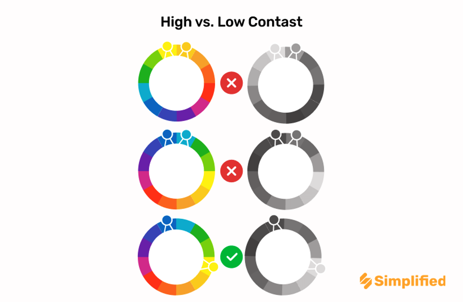
Complementary colors – as the name goes, complementary colors complement each other. They lie exactly opposite on the color wheel. Go for them if you want a dynamic look for the logo.
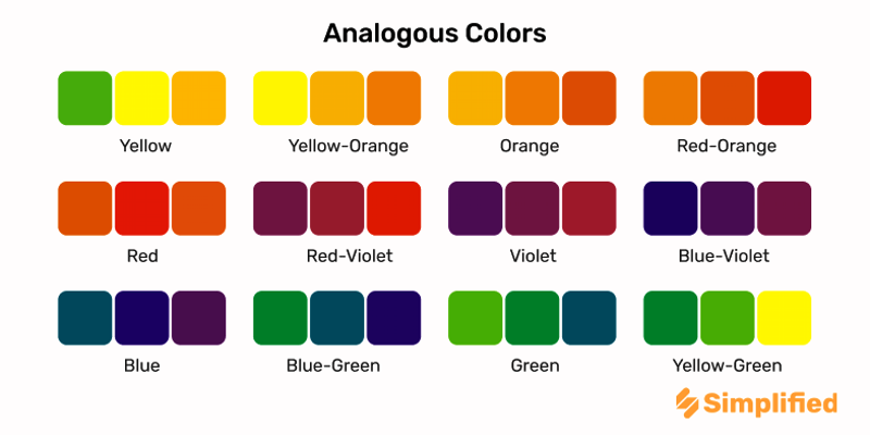
Analogous colors – These are the colors that lie close to each other on the color wheel. So if you want to create a gentle, harmonious look, choose analogous colors from the color wheel.
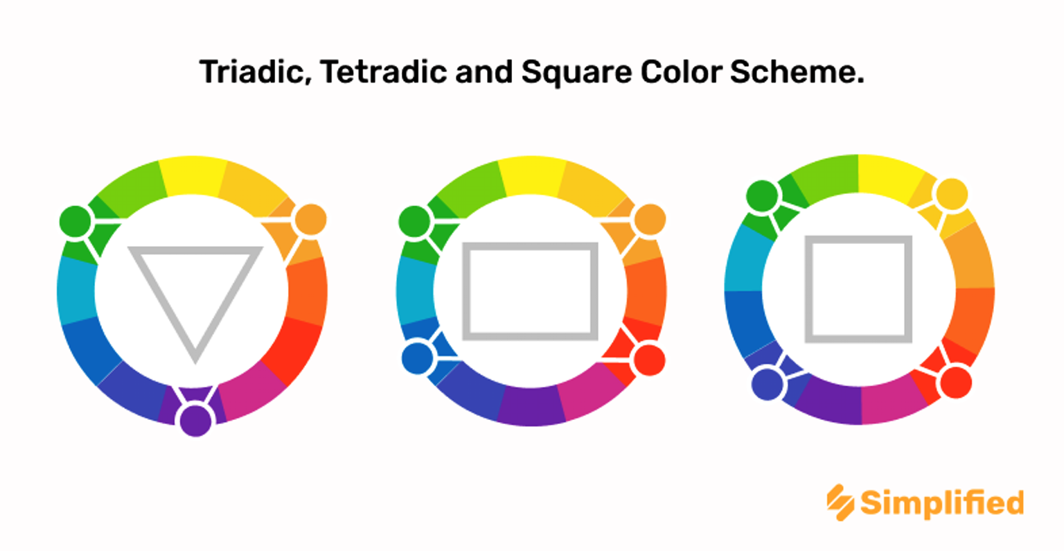
Triadic colors – Draw three equal sections on the color wheels and now pick colors from each section for a bold effect.
Pro tip: Create different color variations for your logo, especially one with a dark and one with a light background. That’s because you can use your logo for printing promotional products like different merchandise for which you will need different color variations.

6. Choose the logo typography
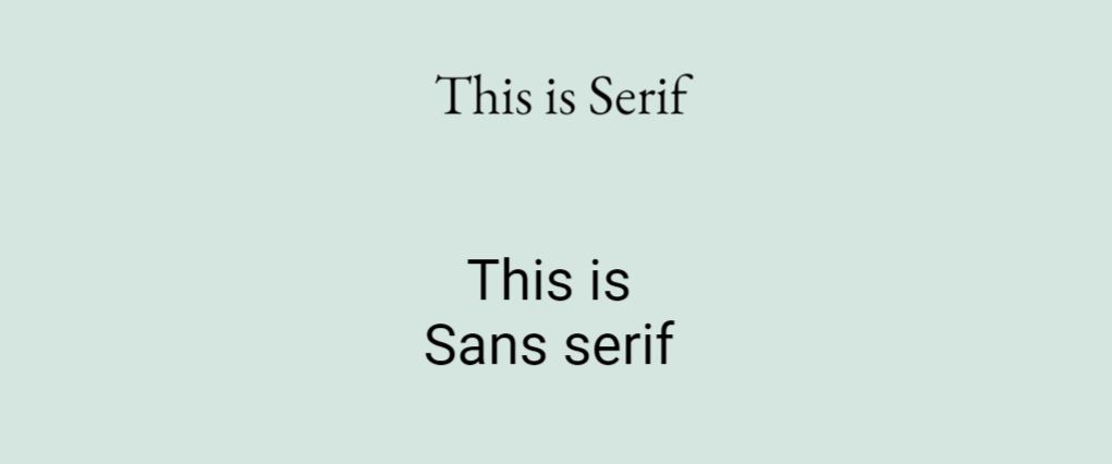
Now that you have sorted the color, it is time to blend the text with the color. Begin with selecting the font. You can choose a font that’s either Serif (with stems on each letter) or Sans Serif (no stems). Avoid choosing generic fonts like Comic Sans or Times New Roman that we generally see in Microsoft Words. Generic fonts won’t help your brand stand out and create anything memorable.
Why does it matter?
Choosing the right typography matters a lot while working on your logo. The way you arrange the letters, the font size all contribute to giving a character to your brand. Your brand can be modern or retro, shy or loud, depending on the typography you choose. The right typography can also increase readability and soothe your audience’s eyes.
How to effectively use typography in branding
Choosing the right typography matters a lot while working on your logo. The way you arrange the letters, the font size all contribute to giving a character to your brand. Your brand can be modern or retro, shy or loud, depending on the typography you choose. The right typography can also increase readability and soothe your audience’s eyes.
Never mix several font types in your logo as a rule of thumb. Your logo design should be harmonious and pleasing to the eyes of the audience. Here are some steps to ensure your brand name and tagline fit cohesively in the logo:
- Choose a font for the brand name and a separate font for the tagline. Try different variations to see which one fits neatly and compliments each other.
- If you need to write other information like the year of establishment, consider writing it in the same font with a different weight to maintain the visual harmony.
- Keep it clean, simple, and easy to read.
Look around for ideas – Famous brands and understanding their typographies
Vogue has used the font, Bodoni. The mix of thick and thin lines with sharp perpendicular serif gives a dramatic appeal to the logo.
Garamond is one of the oldest fonts that’s used mostly in newspapers and magazines. However, many popular brands like Apple, Rolex, American Eagle use it too. The small serifs, moderate contrast, and rounded shapes are the main highlights of this font.
IBM uses ITC Lubalin Graph, a geometric font with intensive serifs. It creates an edgy, bold, and energetic vibe for the brand.

7. Creating your company tagline
Taglines are crucial for marketing a brand. But, not that every time a brand uses its tagline with its logo. Rather a tagline is used for running a special campaign to provoke a certain emotion. Remember the iconic tagline Just do it, or I’m lovin’ it? Do you know why they are so insanely popular and memorable? Because they are simple, short, easy to remember, and above all —- it provokes emotion.
If you’re planning to include a company tagline in your logo, keep it as crisp as possible. Use a few words instead of using a long sentence. Avoid cramming the space with too many ideas.
While choosing the font for the logo tagline, pick a simple font that won’t distract the audience from the brand name. Instead of scripted fonts, choose sans or sans serif fonts for the tagline. It is a good idea to use the same font for your company name, the tagline, but you may reduce the weight of the tagline fonts.
How to create a tagline
Choose a tagline that serves a purpose. Ideally, your tagline stays as long as your brand exists, so do not try to contextualize the tagline with any recent news or trends. Be honest with your tagline, or you may end up changing it frequently. For example, Campbell’s soup in the ’80s used “Soup is good food.” But this tagline was challenged by the FDA since the soup had way more sodium than recommended daily intake dose. The company ended by changing its tagline to “Mmm! Mmm! Good!
Famous brands and their tag lines
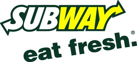
The Subway tagline ‘eat fresh’ has been around for a long time and it indicates the fresh ingredients they use for their subs.
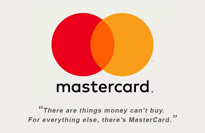
Mastercard’s iconic tagline “there are things money can’t buy. For everything else, there’s MasterCard’ was created in 1997 and since then the tagline went viral globally.
De Beers group created the slogan ‘a diamond is forever’ in 1947 and won the best advertising slogan of the year. The company increased its sales by 55% within three years of coming up with this tagline.

8. Assess your logo
Now that you have got all the style points and ideas in place, it’s time to get into designing and transforming your ideas from paper to a digital format. Create a few options for your logo and evaluate which one would represent your brand best. It is always a good idea to get your options reviewed by others. While assessing the final logo, keep the following points in mind.
- Is it unique or looks just like one of your competitors?
- Can the logo say in 2 seconds what the brand does? Is it solving your purpose?
- Is it appealing? Will it be memorable?
- Is it timeless, or will you need to redesign it after a few years?
- Will it work across different media channels or promotional merchandise?
Free tool to create a logo
Simplified is a great design and AI copywriting tool that can help you build your logo. The design tool has numerous templates, fonts, design elements already inbuilt so you can get started within seconds. The intuitive UI is easy to use, and you won’t need any prior designing experience to get started. Use the AI copywriter to generate your taglines within minutes. Feel free to play around with the tool to create your logo.
Conclusion
Logos are a vital element of your brand identity. When you have all the ingredients of a logo in the right proportion, it can tell a lot about your brand, product, service, and how your audience would perceive your brand. If you are tight on a budget to hire a designer, this step-by-step guide on how to design a logo is all you need to get started. Simplified’s custom fonts, ready-made icons, and free templates can help you design your first logo in minutes. What are you waiting for?
P.S. We have also created this logo design checklist that you may find handy. Check it out!


